Exploring the Evolution and Symbolism of the Iconic Batman Logo

The Batman logo is one of the most recognizable symbols in pop culture. It’s an icon that has gone through various transformations over the years, reflecting changes in comic styles, movie themes, and even society’s perception of superheroes. In this article, we’ll dive deep into the history, evolution, and cultural impact of the Batman logo, uncovering why this simple bat symbol has remained iconic for generations.
1. The Origins of the Batman Logo: A Symbol Born from Darkness
The first appearance of the Batman logo dates back to 1939, with Batman’s debut in Detective Comics #27. Created by Bob Kane and writer Bill Finger, Batman’s early days were marked by a more gothic and mysterious vibe. This was reflected in his logo, which began as a small bat symbol on his chest, simple yet powerful enough to evoke fear in Gotham’s criminals.
The initial logo was minimalistic, featuring just a pair of bat wings spread wide, with no additional details or complex shading. This design served to establish Batman’s brand as dark, brooding, and unlike any other superhero of the time. The symbol was meant to blend into the shadows just as Batman himself did, creating a seamless connection between hero and emblem. Interestingly, this version of the logo was frequently altered in size and shape to fit various panels and cover art, giving the artists some creative freedom but keeping the core bat wings consistent.
As the comics grew in popularity, the logo underwent slight modifications, becoming bolder and more defined. By the 1940s, the logo began incorporating more detailed bat wings, giving it a sleeker and more dramatic appearance. This change was not only artistic but also helped readers instantly recognize Batman’s silhouette even from a distance. The concept of a symbol that blends into the background yet strikes fear in those who see it became a hallmark for the Batman brand, an idea that has persisted through decades.
2. The Evolution of the Batman Logo: Changes Through the Ages

The Batman logo has undergone numerous changes, with each new era of Batman introducing a fresh take on the bat symbol. From the Golden Age of comics to the modern cinematic universe, every iteration of Batman has brought a slightly different twist to the logo, mirroring shifts in comic art styles, technology, and storytelling.
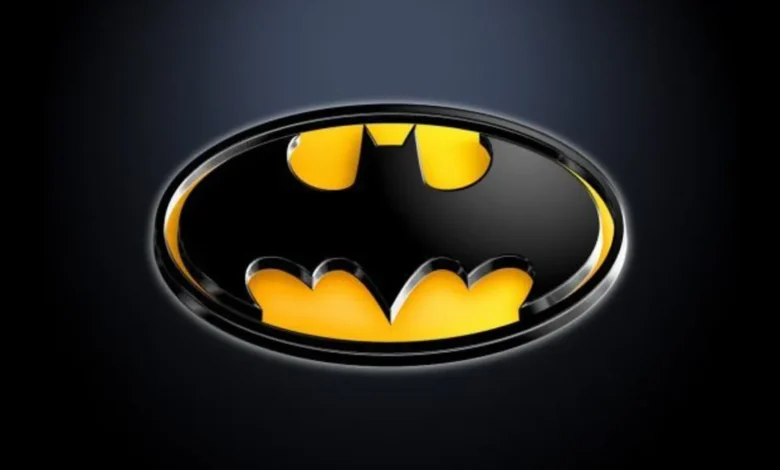
During the Silver Age of comics in the 1950s and 1960s, Batman’s logo began to include a yellow oval backdrop. Introduced in Batman #164 in 1966, the yellow oval was intended to make Batman’s emblem more noticeable, especially during a time when colorful heroes were gaining popularity. This iconic design became popular in the television series featuring Adam West as Batman, giving the logo a campy but lovable appeal. This version emphasized Batman’s lighter side, as the series focused more on fun and action rather than dark, gritty themes.
The 1980s and 1990s saw a return to darker, grittier Batman stories, thanks to works like Frank Miller’s The Dark Knight Returns and Tim Burton’s 1989 Batman film. With these darker portrayals came a logo that shed the yellow oval and returned to a more straightforward, bat-shaped symbol. The logo became sharper, more angular, and less stylized, aligning with Batman’s darker, edgier transformation in popular media.
In the 2000s, Christopher Nolan’s Dark Knight trilogy once again redefined the Batman symbol. Nolan’s films featured a sleek, minimalist version of the logo that was emblematic of the darker, more realistic world he created. This version of the logo was understated yet effective, symbolizing Batman’s blend of mystery and modernity. The focus on a no-nonsense design has continued to influence contemporary portrayals of Batman, with each adaptation giving the bat symbol its own unique twist.
3. The Symbolism Behind the Batman Logo: Power, Fear, and Identity
The Batman logo isn’t just a cool design; it holds deep symbolism that resonates with fans and casual observers alike. Batman’s entire persona is built around the idea of fear—specifically, using fear as a tool against those who prey on the innocent. The bat symbol is intended to strike fear into the hearts of criminals, much as the idea of bats inspired fear in the young Bruce Wayne after a traumatic encounter.
For Bruce Wayne, the bat represents more than just fear; it’s also a shield. Batman uses his logo as a focal point for his costume, drawing attention to his chest, where his suit is often heavily armored. This tactic not only acts as a psychological distraction for his enemies but also serves as a practical advantage in combat situations. The emblem’s placement as the most reinforced part of his suit is a clever blend of utility and intimidation.
The Batman logo has also come to symbolize the duality within Bruce Wayne himself. On one hand, it represents the darkness he embraces as Batman, and on the other, it signifies his mission to protect Gotham and bring justice to its people. Unlike many superheroes, Batman has no superpowers, which makes his symbol even more crucial—it’s a reminder that his strength lies in his will, his intellect, and his unwavering sense of duty. Through the bat logo, Batman channels his fear, pain, and resilience, transforming a personal trauma into a source of power and inspiration.
4. The Batman Logo in Pop Culture: An Enduring Legacy
The influence of the Batman logo extends far beyond comic books and films. Over the years, it has become a pop culture icon, adorning everything from clothing and merchandise to tattoos and street art. It’s a symbol that resonates with people of all ages and backgrounds, standing as a representation of courage, mystery, and a relentless pursuit of justice.
In the 1990s, the logo experienced a surge in popularity thanks to Batman: The Animated Series. This cartoon introduced Batman to a new generation, with a logo that blended classic and modern elements. Its streamlined, recognizable design made it perfect for merchandise, as the series brought the bat symbol into the homes of millions worldwide. From action figures to lunchboxes, the Batman logo became a common sight, establishing a new wave of fans who admired Batman’s sense of honor and determination.
In recent years, Batman’s logo has continued to make its mark in the digital era, from video games like the Arkham series to graphic novels and blockbuster films. Fans have recreated the logo in countless ways, from realistic street art murals to pixelated emblems in retro video games. Batman’s emblem is one of the few superhero symbols that has transcended language and culture, instantly recognizable and universally understood.
5. Why the Batman Logo Remains Timeless
Few superhero symbols have the staying power of the Batman logo. While some emblems evolve with the times, the bat symbol has retained its core elements, proving its timeless appeal. Part of the logo’s longevity comes from its versatility—it can be adapted to fit different tones, from the campy TV series of the 1960s to the dark, intense atmosphere of the Dark Knight trilogy.
Another reason for the logo’s lasting popularity is the relatability of Batman himself. Unlike superheroes with god-like powers, Batman is human, relying on his intellect, physical prowess, and technological resources. This grounded quality makes his logo all the more powerful, as it represents not just a superhero, but an ideal that ordinary people can strive toward. The symbol reminds fans that anyone can make a difference, even without superhuman abilities, as long as they possess courage, determination, and resilience.
The bat symbol has also become a representation of hope, inspiring people to confront their fears and overcome obstacles. It speaks to a universal theme of transformation—of taking something dark and turning it into a force for good. As Batman has shown over decades, a symbol can be more than a logo; it can be a beacon, a reminder that in the face of adversity, there is always a way forward.
Conclusion: The Batman Logo as a Modern Myth
From its early days in the comic pages to its presence on the silver screen, the Batman logo has cemented itself as one of the most enduring symbols in modern mythology. Its evolution is a reflection of changing tastes, artistic styles, and cultural values, but at its core, it remains the emblem of a hero who has inspired generations. The Batman logo isn’t just an icon; it’s a legend that continues to capture the imagination, embodying values of justice, courage, and resilience.
Whether you’re a lifelong Batman fan or simply recognize the symbol, the bat logo represents something more than a comic book character. It’s a symbol of hope, a rallying cry for those who believe in standing up against the odds. And as long as there are stories of Batman, there will be a place for that iconic bat symbol, soaring high in Gotham’s night sky.


